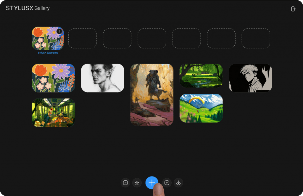
When you tap the “+” icon in the middle of the bottom menu, a new window will open with essential options to create a new artwork. This window is designed to give you the flexibility to customize your artwork’s dimensions, color modes, and more. Here’s a breakdown of all the available settings:
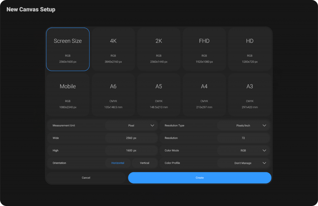
Pre-Configured Settings (Top Section) #
At the top of the window, you will find several pre-configured options for common sizes and color modes. These options are divided into boxes, with each box displaying the specifics of the artwork’s size and color mode. By simply tapping on any of these pre-set options, the settings will automatically adjust to the corresponding size and color mode.
This feature makes it easy for you to quickly choose the most common configurations without manually adjusting each setting. If you wish to customize further, you can move to the section below.
Manual Settings (Below Pre-Configured Options) #
In this section, you can manually input your desired artwork settings. There are 8 main settings that you can adjust to meet your project’s needs:
Measurement Unit #
Pixel #
When to Use: This is the most commonly used unit in digital design, especially for screen-based projects like web design, mobile apps, digital illustrations, and UI elements.
Why Use It: Pixels are the fundamental units of digital images and displays. They represent the smallest building block of any screen, so it’s essential when working with digital media that will be displayed on screens (computer monitors, smartphones, etc.).
Example: If you’re designing a banner for a website, you’d use pixels to define the size of your design.
Point #
When to Use: Points are typically used in print design, especially for typography. This unit is common for setting font sizes in printed materials.
Why Use It: One point is equal to 1/72 of an inch, making it ideal for precise font size and layout settings in design tools, especially in print media.
Example: If you’re designing a brochure or flyer, you’d use points for setting the font size and line spacing.
Inch #
When to Use: Inches are commonly used in both print design and physical space measurements. This unit is appropriate for projects where physical size matters, like posters, flyers, or product packaging.
Why Use It: Inches are a standard measurement in many countries (especially the U.S.) for physical design, making it ideal for projects that will be printed or displayed physically.
Example: If you’re designing a business card, you might set the size to 3.5 inches by 2 inches.
Foot #
When to Use: Feet are commonly used for larger-scale designs that involve significant physical space, such as billboards, large posters, wall decals, or any signage.
Why Use It: When working on designs for large-format prints or installations, using feet helps define the size at a larger scale. One foot equals 12 inches.
Example: For designing a billboard, you may use feet to specify its width and height.
Yard #
When to Use: Yards are used for even larger scale measurements, especially when designing something like banners, flags, or wide-area advertising that spans several feet.
Why Use It: A yard is equal to 3 feet, making it a practical unit for designs that require large expanses of space, such as large banners or stadium signs.
Example: A large event banner could be deasigned in yards to reflect the full size of the display.
Millimeter #
When to Use: Millimeters are often used in precision-based design, particularly in countries that use the metric system. It’s perfect for highly detailed print designs where accuracy is required, such as product packaging, business cards, and other fine print materials.
Why Use It: Millimeters are much smaller than centimeters and are ideal for precise, small-scale measurements.
Example: If you’re designing a small label or product packaging that needs to fit exact dimensions, you’d use millimeters to ensure the exact size.
Centimeter #
When to Use: Centimeters are commonly used in the metric system and are ideal for print projects or designs in countries that use the metric system. It’s widely used for everyday measurements and small to medium-scale design work.
Why Use It: Centimeters are a more general-purpose unit compared to millimeters, making them suitable for a variety of print and design projects.
Example: For designing an A4-size document, you might use centimeters to define the dimensions.
Width & Height #
Location: Below the “Measurement Unit” setting.
You can manually input the Width and Height for your artwork. These values define the physical dimensions of your artwork.
Orientation #
Location: Below the Width and Height fields.
This setting allows you to adjust the orientation of your artwork. You can select between Horizontal or Vertical. Changing this option will switch the values for width and height, flipping the artwork’s dimensions.
Resolution Settings (Right Section) #
On the top-right of the window, you will find several settings related to the resolution and color mode of your artwork.
Resolution Type #
Location: Top-right corner of the window.
Here, you can choose between two types of resolution:
Pixels/Inch: Ideal for digital displays.
Pixels/Cm: Suitable for metric-based designs.
Resolution #
Location: Below the “Resolution Type” setting.
The Resolution value defines how sharp and detailed your artwork will be. For digital work, a resolution of 72 pixels/inch is recommended, while for print, a resolution of 300 pixels/inch is typically used. You can enter a custom resolution value depending on your specific needs.
Color Mode #
Location: Below the Resolution field.
The Color Mode determines the color space your artwork will use. You can choose between:
RGB (Red, Green, Blue): Ideal for digital displays and web content.
CMYK (Cyan, Magenta, Yellow, Black): Used for printing purposes.
Color Profiles #
Depending on the selected color mode, you will have different color profiles available:
RGB Color Profiles #
RGB (Red, Green, Blue) color mode is commonly used for digital screens (like monitors, mobile devices, and TVs). The following profiles are available under RGB:
Don’t Manage #
When to Use: This option is best when you don’t want to apply any color management to the image. The colors will be displayed as they are, without any adjustments or optimizations for specific screens or devices.
Why Use It: You might use this if you want to work with the image in its original color state or if you plan to manage color elsewhere in the workflow.
Adobe RGB 1998 #
When to Use: This is a popular RGB color space that offers a wider range of colors compared to sRGB, making it ideal for professional photography and design work.
Why Use It: If you are preparing images for high-quality printing or you need a broader color gamut for digital artwork, Adobe RGB 1998 is a good choice. It is widely used in the print industry.
Display P3 #
When to Use: This color profile is optimized for displays, especially modern Apple devices like iPhones and Macs, which support the P3 color gamut.
Why Use It: If you’re designing for Apple devices or want your artwork to be optimized for displays with a wider color gamut, Display P3 is ideal. It provides richer colors than the standard sRGB profile.
sRGB v4 ICC Appearance #
When to Use: This profile is used for web and screen design. It’s the standard RGB color space for most digital displays, including browsers, monitors, and smartphones.
Why Use It: If your work is intended for viewing on the web or standard screens, sRGB v4 is the most widely used and compatible choice, ensuring your colors appear as expected across most devices.
sRGB v4 ICC Performance #
When to Use: This option is used for situations where consistent color performance is crucial, often in professional web and digital photography workflows.
Why Use It: If you need reliable and consistent color performance on sRGB-compatible screens, this profile ensures that colors are more accurate and true to the source across different devices.
sRGB v4 ICC Performance Display Class #
When to Use: Similar to the previous one, but this profile is specifically designed for displays that require high color accuracy.
Why Use It: Use this when you need to manage the display performance and color consistency on professional screens, ensuring the colors displayed match the true color profile.
CMYK Color Profiles #
CMYK (Cyan, Magenta, Yellow, Black) is used for printing purposes. The following profiles are available under CMYK:
Coated FORGA 27 #
When to Use: This profile is used for printing on coated paper types, which have a smooth, glossy finish that provides rich, vibrant colors.
Why Use It: If you are preparing artwork for commercial printing on coated paper, this profile is ideal as it will help ensure the colors are accurately represented during the printing process.
When to Use: This is another coated paper profile used in printing. It is designed for specific coated paper types used in European markets.
Why Use It: When printing in the European market on coated paper, this profile ensures your colors will be reproduced correctly based on regional printing standards.
Coated Forga39L VIGC 300 #
When to Use: Similar to the previous one, but designed for different coated paper types or print processes, possibly for larger or more detailed prints.
Why Use It: Use this profile when printing on coated paper with specific print requirements, especially in large-scale print jobs or fine art prints
GRACoL 2006 Coated 1v2 #
When to Use: GRACoL (General Requirements for Applications in Commercial Offset Lithography) is a set of printing standards widely used in the United States for offset printing. This profile is for coated paper and is part of the GRACoL 2006 standard.
Why Use It: If your artwork is being prepared for offset printing in the U.S. on coated paper, GRACoL 2006 is the most appropriate profile for accurate color reproduction.
GRACoL 2013 CRPC6 #
When to Use: This is another GRACoL profile, part of the newer 2013 standards. It is used in commercial printing for achieving more consistent results with modern printing technologies.
Why Use It: Use this profile when preparing artwork for high-quality printing in the U.S. with the latest printing equipment and standards.
GRACoL 2013 Uncoated CRPC3 #
When to Use: This is a variant of the GRACoL 2013 profile for uncoated paper, typically used for matte finishes.
Why Use It: If your project will be printed on uncoated paper (such as business cards, letterheads, or flyers), this profile ensures the colors are properly represented in the final print.
SWOOP 2006 Coated 5v2 #
When to Use: SWOOP (Specialist Web Offset Offset Paper) is a European-based printing standard, and this specific profile is for coated paper used in web offset printing.
Why Use It: If you are preparing artwork for high-volume web offset printing on coated paper in Europe, this is the right profile for consistent color output.
SWOOP 2013 C3 CRPC5 #
When to Use: This is the updated SWOOP 2013 profile for modern web offset printing on coated paper in Europe.
Why Use It: If you’re working with more recent print standards in Europe, this profile provides the latest color management for web offset printing.
Uncoated Forga47L VIGC 260 #
When to Use: This is another profile designed for uncoated paper used in print production, particularly for high-quality print jobs in Europe.
Why Use It: If you are designing for uncoated paper printing in Europe, use this profile to ensure the colors are managed correctly for an uncoated finish.
Uncoated Forga47L VIGC 300 #
When to Use: Similar to the previous profile but designed for larger or more complex print jobs on uncoated paper in Europe.
Why Use It: When printing on uncoated paper in Europe with larger or more detailed prints, this profile will ensure accurate color reproduction.
Finalizing the Artwork Creation #
At the bottom of the window, you’ll find two important buttons:
Create #
Location: On the right side of the window.
Once you have customized all the settings to your preference, click Create to finalize the creation of your new artwork. This will open your artwork and allow you to start working immediately.
Cancel #
Location: On the left side of the window.
If you decide not to create the artwork, click Cancel to close the creation window. You can also close the window by tapping anywhere outside of it.
By following these steps and settings, you can easily create customized artwork that meets your specifications, whether for digital or print projects. The interface provides a smooth, intuitive experience, allowing you to quickly get started with your work.
Import Artwork File or Image #
When you click on the last icon on the left, represented by a downward arrow, the file browser will open. This allows you to select a file in the program’s supported format (such as StylusX file format) or an image file.
After selecting the desired file and clicking “Open,” the artwork will be imported and opened in the program, ready for you to begin working on. This feature is designed to facilitate easy access to your existing artwork files, allowing for seamless integration of previously created work or external images into your current project.
You can also drag and drop an image directly from outside the program into the workspace. Once dropped, the image will automatically open and be added to your current project. This feature provides an efficient and intuitive way to quickly bring in external images without needing to navigate through the file browser.


