Color Harmony #
The fourth icon on the left allows you to create and manage custom color harmonies.
Enhance your artwork with the power of color theory.
Harmony generates instant color schemes based on your chosen color. These schemes include Complementary, Split Complementary, Analogous, Triadic, or Tetradic, helping you create balanced and vibrant compositions.
Hue / Saturation Disc #
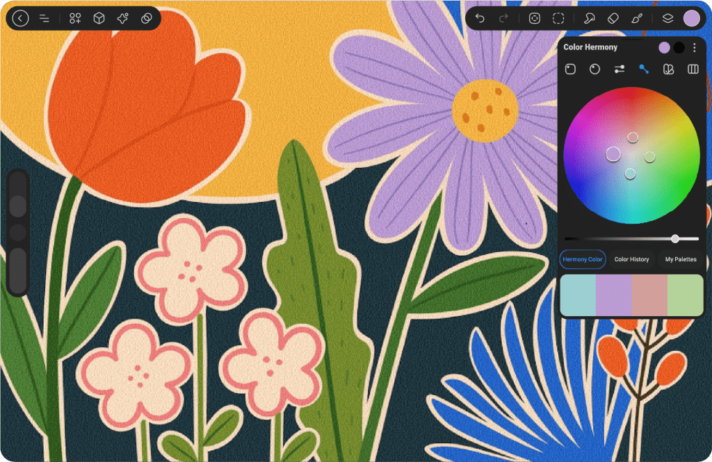
The Harmony interface merges Hue and Saturation into a single color wheel. Colors at the outer edge of the wheel represent maximum saturation, while colors toward the center are progressively less saturated.
Brightness Slider #
To modify brightness, simply drag the black-and-white slider located below the color wheel
The Harmony color wheel features one or more secondary reticles, depending on the selected Harmony mode, alongside the primary reticle. As you move the primary reticle, the secondary reticles shift to display your chosen harmonious colors.
The number of secondary reticles changes based on the active Harmony mode.

Modes #
Select from Four Harmony Modes
Choose from five different modes to create harmonious color schemes based on classic color theory.
At the top right of the Harmony interface, tap the three dots to access the default Harmony mode, to view the full list of all five Color Harmony modes.
Complementary #
Two reticles select colors from opposite positions on the color wheel.
As exact opposites, complementary colors make each other appear more vibrant. One will always be a cool color, while the other will be warm. Together, they create the highest contrast on the color wheel. These colors can mix to produce neutral hues or blend together to create shadows.
Analogous #
Three reticles select colors that are evenly spaced around the color wheel.
The Triadic color scheme uses three colors that form a triangle on the wheel, offering a balanced and vibrant combination. This scheme provides high contrast while maintaining harmony, as it combines both warm and cool colors. The primary color is usually the dominant shade, while the other two serve as accent or complementary colors, resulting in a dynamic yet balanced palette.
Triadic #
Three reticles select colors in an equilateral triangle formation on the color wheel.
This variant of the split complementary color scheme spaces the three colors evenly apart, making all three equally dominant. The result is a vibrant and bold combination, which can add energy to your artwork. However, it’s important to carefully balance these colors to avoid overwhelming the composition.
Square #
Four reticles select colors in a square formation, with the colors positioned at opposite corners of the color wheel.
Similar to the Triadic scheme, the Square (Tetradic) arrangement places equal distance between all four colors, creating a balanced combination. This results in a vibrant, colorful palette where no single color dominates. While the colors can be striking when used together, they can be intense, so careful planning and a thoughtful approach are essential to achieve the best visual effect
Color Harmony Box #
When using the Color Harmony mode, the Color Harmony Box replaces the Color Shades. This box displays the available colors within the selected harmony scheme, such as Complementary, Triadic, or Analogous. You can select any color from these options and switch between them easily by moving the reticle inside the box.
The colors are automatically updated based on the chosen harmony, providing a flexible experience for selecting complementary and coordinated colors in real-time.


